Finland Next To A Lake (in Finland) That Looks Finland
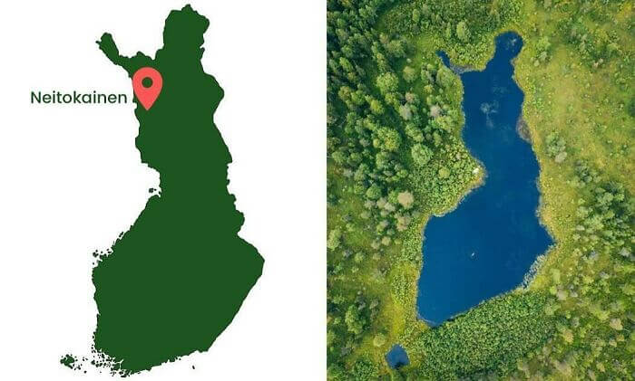
We're pretty sure whoever drew Finland's border didn't have this lake in mind when they were drawing lines on a map. However, there just so happens to be a lake in Finland that's shaped almost exactly like the country. In addition to just being the same general shape, it also has a little inlet in the northwest corner of the lake that juts out like the country's northwestern peninsula.
There's also another small lake or pond just south of the main body of water that looks like one of Finland's islands. What are the odds of that happening?
An Accurate 1567 Map By Ottoman Sailor Ali Macar Reis
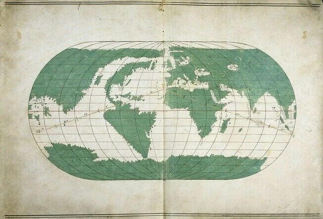
While we take satellite images and Google Earth for granted today, it's easy to forget just how much of an accomplishment it was to create an accurate map of Earth centuries ago. This map was drawn by an Ottoman sailor named Ali Macar Reis in 1567, and it's extraordinarily accurate for its time. All of the continents are there, even if North America looks a little leaner compared to how we know it looks.
Perhaps one of the most incredible things about this map, and other ancient maps like it, is that Antarctica is included despite not being visited until the early 19th century. The ancient Greeks had theorized that it existed despite no one ever traveling there.
Mapping Europe's Castles
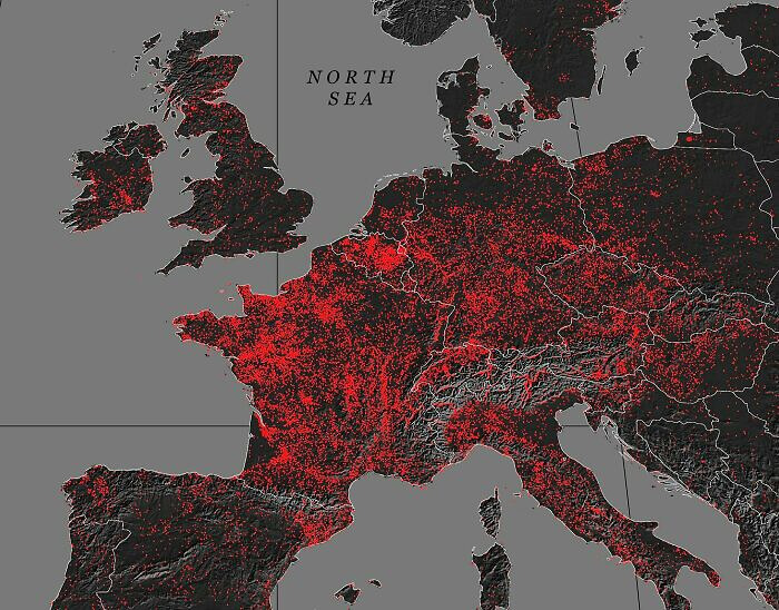
If you've ever been anywhere in Europe, then you know that castles dot the landscape. However, it's hard to comprehend just how many castles there actually are without looking at this map. Each tiny red dot represents a castle, and they're literally everywhere. France is almost completely covered in red. There must be a dot for just about every city and town in the entire country by the looks of it.
There are even castles dotting what we are assuming are valleys throughout the Alps. And if you were wondering, the southwest dark spot in France is marshy and filled with woodlands.
World Map Pencil Case
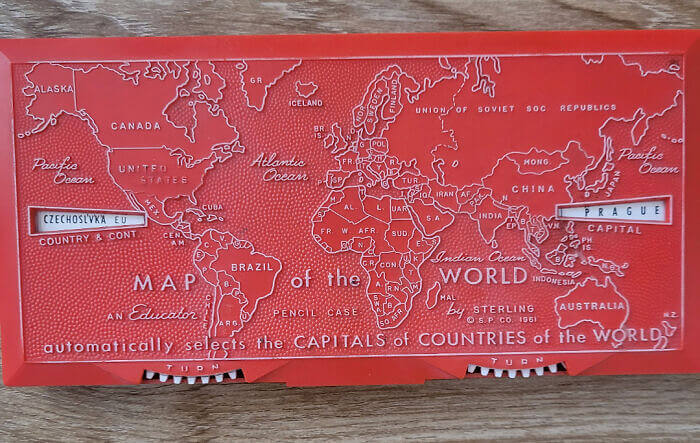
This is probably the coolest pencil case we've ever seen. It's a case that contains the entire world map on it. Not only that, but you can play around with the wheels on the bottom to bring up different countries and their capitals. There's not enough room in a lot of places to spell out the entire names of some countries, but it still gives you the abbreviations for country names.
We're sure a lot of students had theirs confiscated before geography tests, but it's still a really unique pencil case, and it beats the plastic Zip-Lock bag we had.
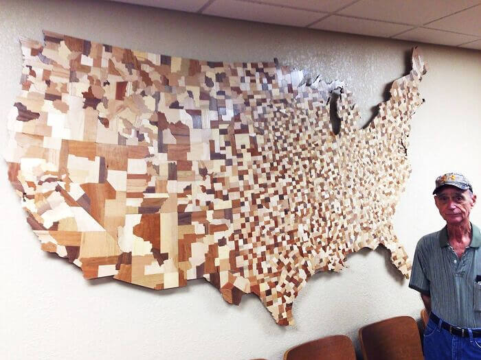
A Woodblock Map Of U. S. Counties
Creating an entire map of the U.S. out of wood would be hard enough, but creating it out of counties is just insane. This map was put together after intricately cutting the distinct shape of each county from wood. And if you're wondering how many counties there are in the continental U.S., it's actually more than 3,000 in total. You can also kind of tell what areas are more populated by the number of blocks.
Most of the western U.S. contains larger, probably less populated counties, while the further east you go, the more counties there are. Of course, the west coast also contains a lot of smaller counties.
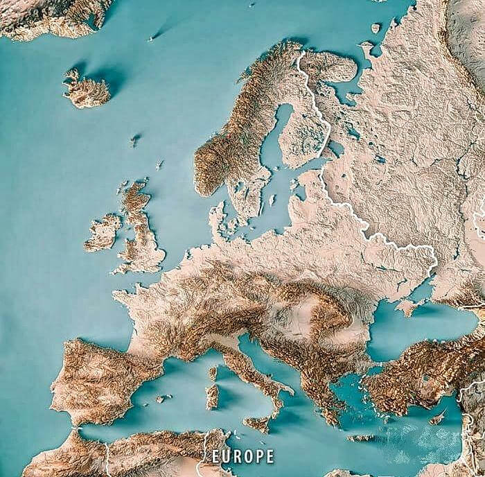
Topographic Map Of Europe
Europe is filled with all kinds of amazing landscapes, including lush forests, idyllic mountains, and sunny coastlines. This topographic is like an extreme aerial view of that scenery. You can easily make out the changes in elevation of just about every country on the continent. Unsurprisingly, places like the Alps, Scotland, and Spain contain locations with much higher elevations than many other places in Europe. Greece and Turkey also look very rocky on this map.
It's a bit weird to see a map of Europe that's devoid of border lines and the names of countries, but it's also a bit refreshing and allows you to really get a feeling for the place.
Comparing The Obesity Rate Of The U. S. With Europe
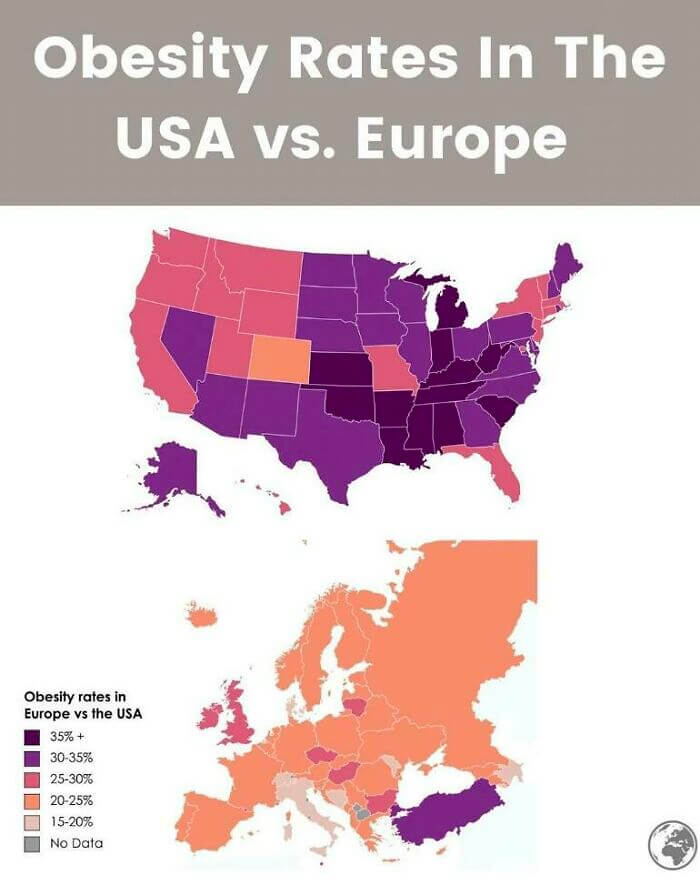
This is an interesting map that compares the obesity rate of the U.S. with the entirety of Europe. As you can see, the rate in Europe is much lower, except maybe for Turkey. This is probably due to a couple of different factors, such as overprocessed foods, poverty rates, and a lack of walking opportunities. However, obesity is still much more prevalent in the U.S. than we would've thought had we not seen this map.
There are only a handful of countries, aside from Turkey, that even come close to matching the U.S. obesity rate in Europe. Italy has among the lowest rates in Europe.
Legal Status Of Conversion Therapy Around the World
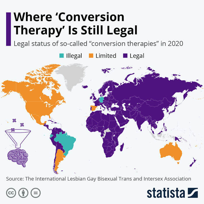
This map is from 2020, so it isn't entirely up to date, but it shows the legality of so-called conversion therapy around the world. Surprisingly, it was legal to a large degree just about everywhere. It should also be noted that just because it might technically be legal in a country, that doesn't mean that it's common. Still, it's kind of crazy that so many countries had failed to outlaw outright as of a couple of years ago.
Some of the countries that have moved to outlaw conversion therapy since this map was released include Canada, France, New Zealand, and a few other countries. Some U.S. states ban the practice.
When Americans Are Asked To Identify Iran
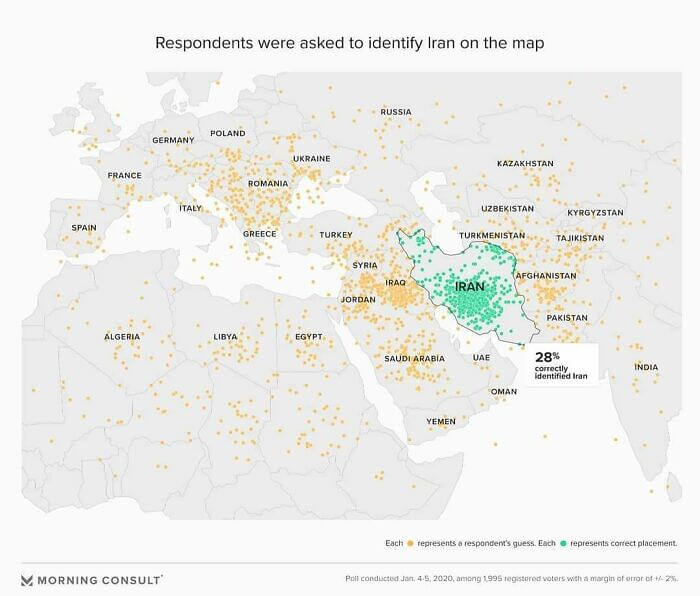
This is a pretty wild map that shows where Americans pointed to when they were asked to locate Iran on a map. As you can see, many of them pointed to places that are not even close. There are dots everywhere, but some of the more surprising locations include the U.K., France, Russia, Spain, and Italy. Many also seemed to want to place it in Eastern Europe for some reason.
That said, a large number of people did manage to locate it successfully next to Iraq. We're also a bit worried about the people who pointed to random spots in the ocean.
Countries Russia Has Been At War With
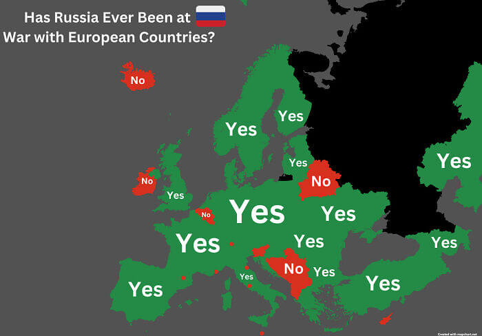
This map shows all of the European countries Russia has been at war with at one point or another. There are only a handful of countries that don't fall into the "yes" category. However, we're sure that this could also be said for a number of other countries on this map if you go back far enough into history. Still, this map is helpful in showing why the 20th century was sort of rocky.
That goes for both sides. Some of the countries tagged "yes" on this map were the aggressors, such as France with Napoleon. The country next to Russia labeled a "no" is Belarus in case you were wondering.
Visualizing The World's Population
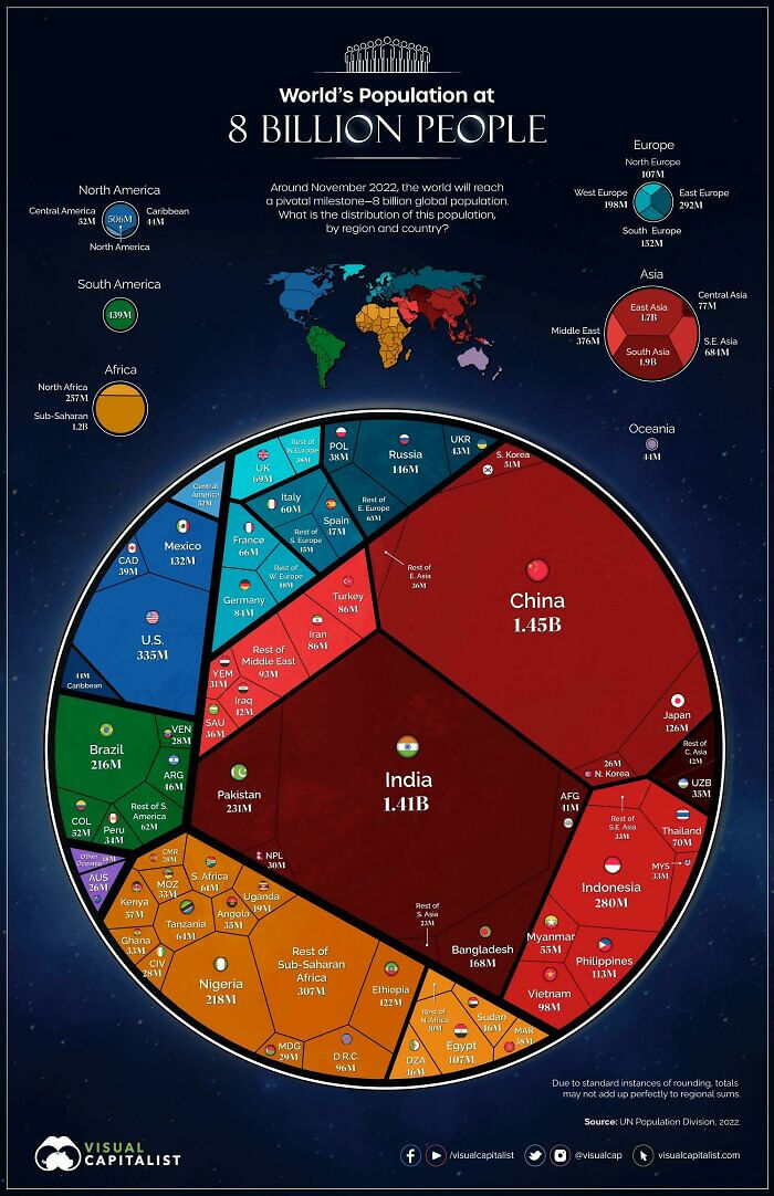
As far as maps go, this one is pretty unique. It's a visualization of the world's population divided up by location. So, it allows you to see how many people are on each continent and in what countries those people live. Unsurprisingly, Asia contains the majority of the world's population. However, India isn't as far behind China as we thought they were. The Oceania region also has much fewer people than we thought.
The U.S. and Mexico account for the majority of North America's population, while a handful of European countries dwarf their neighbors when it comes to the number of people living there.
Someone Rode Their Bike Across Europe And Mapped It
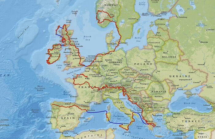
Unlike most of the other maps on this list, this map depicts one individual's journey through Europe. This person rode through Europe on their bike and tracked themselves the whole way through. We're not sure exactly how long it took them, but they ended up riding across 11,877 miles, which honestly sounds like the adventure of a lifetime. They rode through Sweden, France, Italy, Greece, the U.K., and Ireland.
It also appears as though they took a couple of ferries during their journey because we're pretty sure that they didn't just ride across the Mediterranean on their bike.
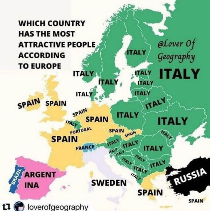
Mapping European Opinions On Most Attractive People
This map is about as interesting as they come. It shows where the people of each country think the most attractive people live. There are some answers here that make sense, given history, such as Portugal's obsession with Brazil. However, Italy and Sweden's love affair is a bit baffling. Pretty much every Western European country thinks that Spain hosts the most attractive people, while Eastern Europe is focused on Italy.
Turkey seems to be the only outlier in thinking that the most attractive people come from Russia. We're also kind of surprised that Switzerland was the only country to pick France.
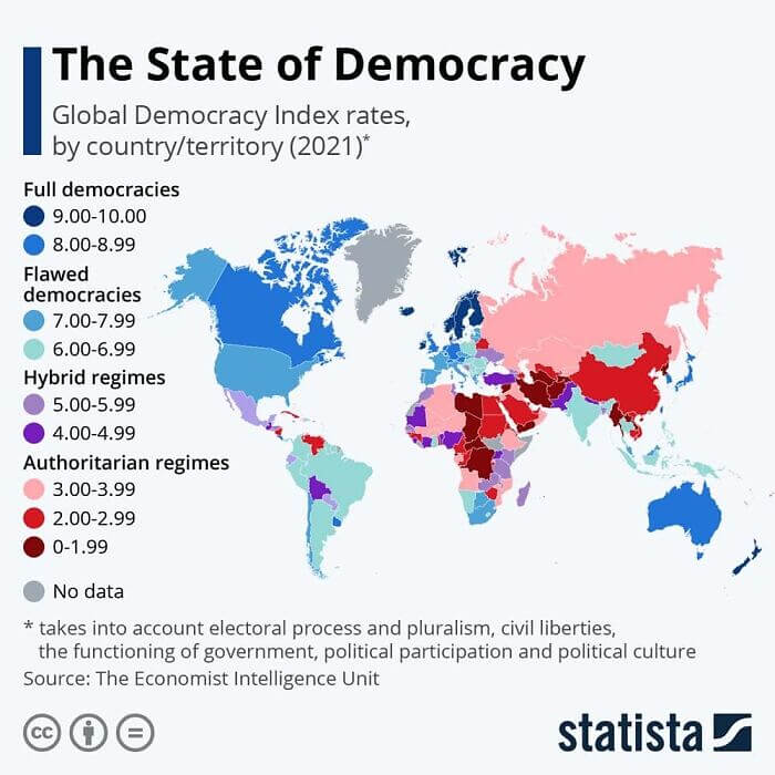
A Map That Tracks The State Of Democracy
As we're sure everyone out there already knows, democracy requires constant upkeep. And this map shows exactly why. It shows the state of democracy throughout the world, including in countries that are traditionally thought of as being very free, such as the U.S., France, Canada, and Japan. Many of those same democracies aren't quite as thriving as many people would like to think. South America is also filled with countries where democracy is only doing okay.
Of course, the map also shows countries where authoritarianism is still the ruling system. This includes countries like Russia and China, as well as Turkey and Belarus in Europe.
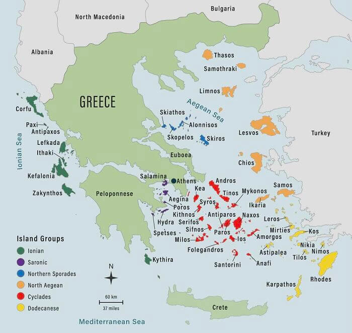
The Extent Of Greece's Islands
It's hard to tell just how many islands are located off the shores of Greece and Turkey when looking at a world map. They're usually just too small and numerous to be able to depict accurately. However, this map depicts them fairly well, and it also breaks them up according to their island groups. As you can see, Greece includes many islands, some of which are extremely close to Turkey.
This also helps explain why Greece and Turkey aren't the best of friends when it comes to political and historical relations. You can pretty much throw a rock from one country, and it would land in the other.
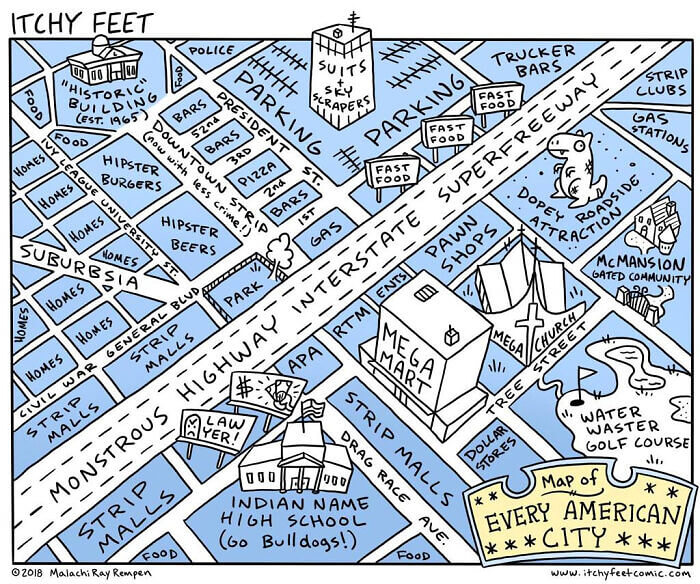
A Map Of "Every" American City
If you live in the U.S., then you can probably relate to this map that someone drew of "every" U.S. city everywhere. It's basically a hodgepodge of stereotypical America, but it's still pretty funny nonetheless. The lawyer billboards are especially accurate, as is the dopey roadside attraction. However, we personally love the dopey roadside attractions in the U.S. They're kind of charming in a weird and wacky way, whether they're basically just a giant dinosaur or a hotel shaped like a giant shoe.
And while the trucker bars seem to be in the right place, we must say that the strip clubs are usually somewhere near all the strip malls since you want easy access from the interstate.
China's Different Languages
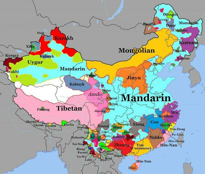
China is pretty large, really large, in fact. It's also filled with a lot of people of different ethnicities. This map gives you a sense of all those different ethnicities. It shows all of the different dialects spoken in China broken down by region. We expected to see Tibetan and Cantonese on this list, but we didn't actually know there were that many people speaking the Mongolian dialect and living within China.
There are also a dozen or so different dialects spoken close to the border with Vietnam, in addition to the Uyger dialect in western China. The latter of which has been in the news lately.
Mapping The World's Most Polluted Cities
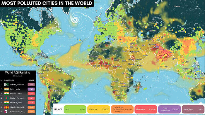
This map is a bit depressing as far as maps go. It shows the pollution levels of the world's cities. Those in India, parts of Africa, and even slivers of South America stand out with extremely high levels of pollution. That said, we imagine that this map is probably only tracking air quality and pollution since you can see bands of yellow-level pollution over parts of the Atlantic Ocean.
Parts of Eastern Europe also suffer from lower air quality, which is probably a remnant of Soviet-era industry that's still going on in those countries. Turkey's air quality is also pretty low.
Pedestrian Signs In Different Countries
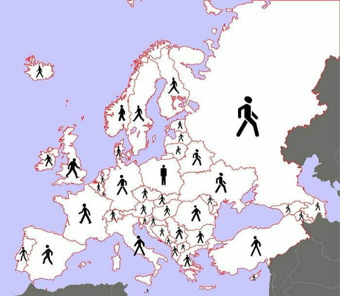
This map is pretty lighthearted. Since there are no agreed-upon international rules for pedestrian signs like there are for the colors of street lights, each country is free to go with its own version. This map shows the version used by every country in Europe. Most of them are pretty similar, with a stick figure either walking to the left or to the right, but there are some outliers.
The figure in the U.K. is pretty distinct. And both Turkey and Italy use a figure with really long legs. Funnily enough, it also looks as though the rest of Europe is walking away from Poland on this map.
How Countries Say Number 92 (Or Any Double Digit Number)
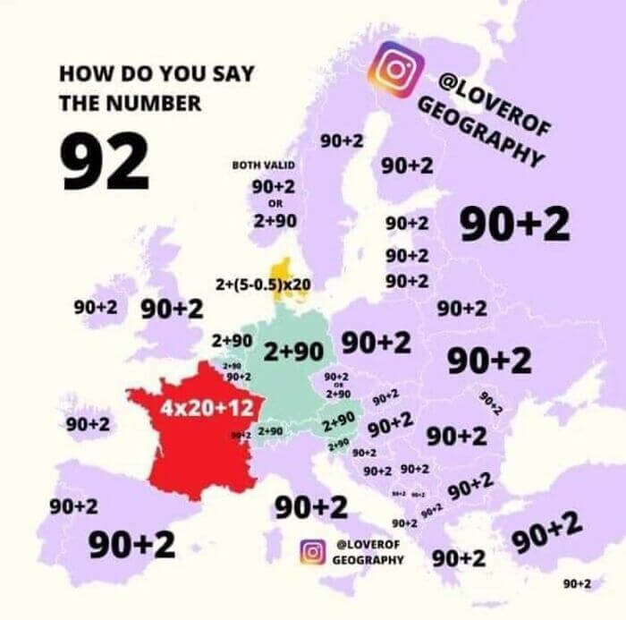
Here's a map that we never thought we needed before now. It shows how all of the different countries in Europe say the number 92. As you can see, there seems to be a general consensus on how to say double-digit numbers. Most countries go with 90+2 or 2+90. That is except for France and Denmark. We're not sure what the deal is with either of those or how to say them.
We're sure that if you live in those countries and speak French or Danish, then it just comes naturally, but we couldn't imagine the mental and literal math if either of those isn't your native tongue.
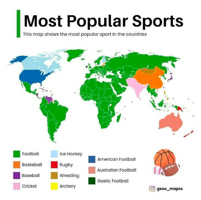
Most Popular Sports Around The World
We probably didn't need a map for this one since most people know that soccer is the dominant sport around the globe. However, there are a couple of interesting exceptions shown here. For example, we had no idea that basketball was so popular in China. And what exactly are Gaelic and Australian football? It's also really hard to make out exactly what country is really into archery despite it being listed at the bottom of the map.
Baseball makes sense for some of the countries in Central and South America, as well as Japan. And, of course, American football is the most popular sport in the U.S.
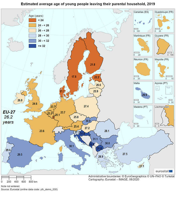
Average Age Of Children When They Leave Their Parent's House
This map shows the average age at which children leave their parent's house in each country in Europe. Obviously, some of these are going to be high because of different cultural norms. For example, in some countries, it's perfectly normal and fine to live with your parents until you get married. However, some of these are also probably due to lower wages and poorer economic circumstances. Some of the lower age numbers are a bit perplexing, though.
The average age of most people leaving their parent's house in Sweden is extremely low, which might be due to people leaving and living elsewhere for school or for work.
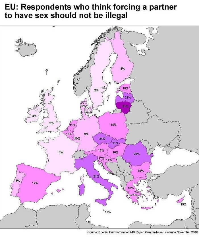
Percentages That Think Forcing Partners To Have Sex Is Okay
This map from 2016 shows the percentage of people that think forcing a partner to have sex shouldn't be illegal. And while 2% is still pretty high, there are some numbers on here that get well into the double digits. Nearly all of Eastern Europe is in the double digits, with some countries even hitting at high as 31% of respondents. Italy is also pretty high, with around 21%.
It's also especially high in Germany, which is a bit surprising, considering that they usually have pretty strong laws concerning gender-based violence and other things such as that.
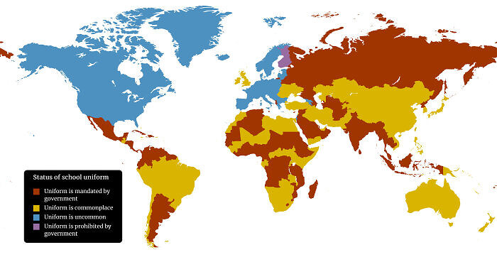
School Uniform Policies By Country
No matter where you grew up, you should be able to relate to this map. It shows what the school uniform policies are in just about every country in the world. There is a surprising number of countries where school uniforms are mandated by law. It even might be the majority of countries. It says that uniforms are uncommon in the U.S., but depending on where your school district is located, that could different.
There's also only one country that we can find where school uniforms are just outright banned by the government, and that's Finland. The education system in Finland also has a couple of other quirks but it seems to be working out for them.
The Historical And Present Day Ranges Of Lions
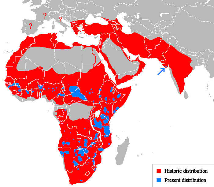
Here's another map that reveals just how much humans have decimated wildlife. It reveals the historical range of lions in Africa, Europe, the Middle East, and Asia. The blue is where you can find them today, and it isn't in many places. Lions are now only situated mostly around central and southern Africa. There is also a small pocket of lions located in India, where they used to roam throughout the entire country.
You could probably point to just about any large animal on the African continent and make a similar map to this one, especially if they're a large predatory animal.
Historical Forests In Germany Compared To Present Day
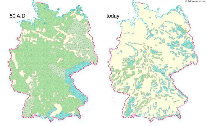
While Germany is generally thought of as a pretty heavily forested country today, there used to be far more woodland in the country. This map shows the areas of Germany that were predominantly covered in forests around 50 A.D. on the left. You can see present-day Germany on the right and what little forest still remains in the country. At least what little forest still remains on a large scale.
There also appear to be fairly few historical areas in Germany that didn't harbor forests, as say compared to a place like the U.S., where the central part of the country has always been made up of plains.
U. N. Vote To End Cuban Embargo
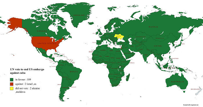
This map shows how every country in the world voted when it came to a U.N. resolution to end the Cuban embargo. Only two countries voted against the resolution, and those were the U.S. and Israel. Ukraine and Moldova abstained from the vote altogether, but you can still see a pretty apparent trend here. Most of the world thinks that it's time to end the embargo on Cuba more than 50 years after it was instituted.
However, that doesn't seem like it's going to happen anytime soon, despite a nearly worldwide consensus around the matter and the reestablishment of relations between the two countries under former President Obama.
Countries With The Death Penalty
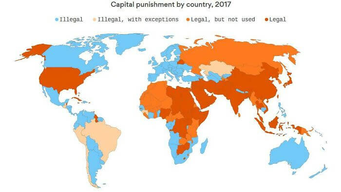
This map shows how different countries around the world deal with the death penalty, and there are quite a few more countries that ban it outright than we thought. It's still legal and used in the U.S., though it is illegal in the majority of states in the U.S. You can tell it's a controversial topic when some countries are labeled as "illegal, with exceptions" or "legal, but not used."
If you were wondering, Brazil only allows the death penalty for crimes against humanity, terrorism, war crimes, and genocide. Israel has exceptions for similar crimes, though the country has ever only used the penalty once.
Terrorist Attacks In Europe From 1950 To 2015
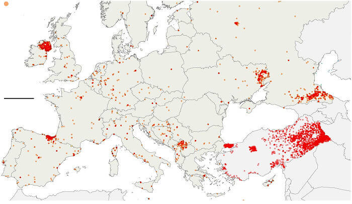
Here's another map that tracks violence; this one identifies all of the terrorist attacks that occurred in Europe from 1950 to 2015. It's easy to make out a couple of prominent hot spots on the map, such as Northern Ireland. However, there are also some clusters that seem like anomalies, such as those in Nordic and Eastern European countries. Turkey has quite a few attacks dotted in the eastern parts of the country.
There is also a pretty large cluster around eastern Ukraine and countries Russia had conflicts with in the 1990s. There also seem to be a couple of scattered dots deep in Russia.
The World's Most Surveilled Cities
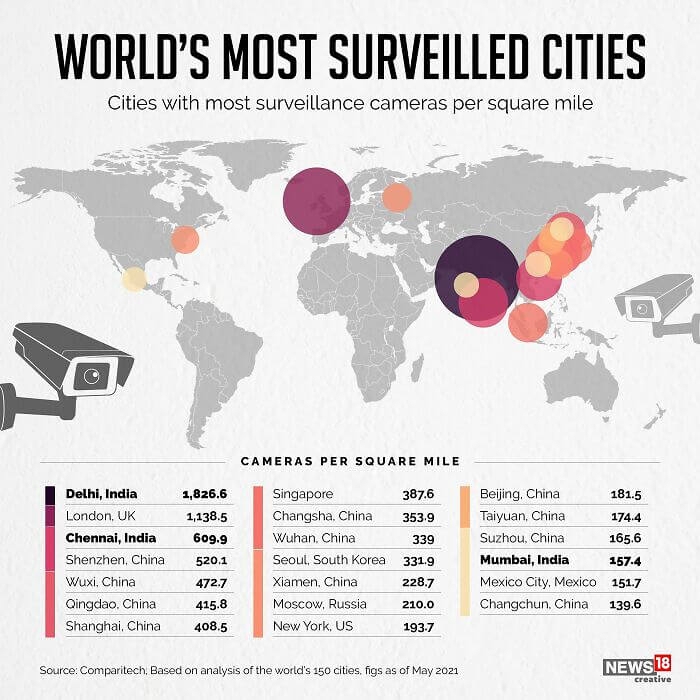
That's right; it's a map showing the world's most surveilled cities. Unsurprisingly, many of the most surveilled cities are located in China. However, London is pretty high up there on this list, as is New York. There are a couple of cities in India that also rank pretty high when it comes to not giving their citizens any privacy at all. Sadly, we don't know where North Korea stands, but we'd have to guess pretty high on this list.
It's also not clear if this map counts CCTV and home cameras or just government-based surveillance. However, we'd have to imagine that it's probably the latter if we had to guess.
Countries With U. S. Military Bases
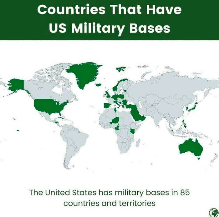
It's no secret that the U.S. has a lot of bases in countries around the world. There are some 85 countries and territories that play host to U.S. military bases. This map shows them all in green. There are countries you might expect, such as Japan, Germany, and Australia, but there are also some that you might not expect. For example, Cuba is listed because that's where Guantanamo Bay is located.
There are also a couple of military bases in central Africa, as well as located on numerous different islands that are hard to make out on this map.
A Map Of The Americas
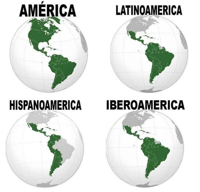
This interesting little map breaks up the continents of North and South America (or just America, depending on where you went to school) into different zones. The top left map shows the entirety of America, while the map in the top right corner shows Latin America. The bottom left shows countries with historical ties to Spain, while the bottom right shows countries with historical ties to both Spain and Portugal.
There are a couple of territories and countries here that still belong to European countries, such as French Guiana, so they are grey on all four of the maps.
Naming Conventions In Different Countries
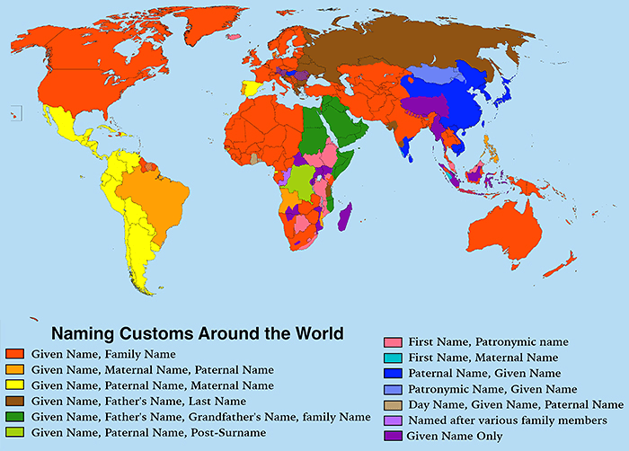
Although it's a little hard to make out at first, this map is actually really interesting. It shows the different naming conventions around the world, and some of them are pretty wild. We're all used to seeing someone named in some combination of their parents, grandparents, or family's names. However, there is one on here where it's the norm to name a child after the day of the week they were born on.
We've come across people named Tuesday in real life, but we don't think they were actually born on that day. Although, after seeing this, we're starting to second-guess that assumption.
Life Expectancy Around The World
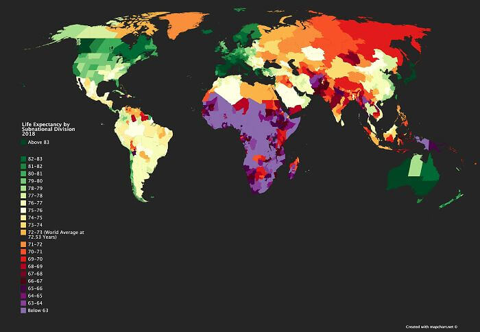
This colorful map shows you how old you can expect to live according to where you live. And it even breaks it down by region. There are a couple of hotspots on here where people can expect to live over 83, but they are very few and far between. Western Canada is one of them, as is Japan. The life expectancy in the U.S. is pretty low compared to other Western democracies.
It's also not quite as high as we would've expected it to be in some South American countries. Australia seems to be doing fairly well except for maybe one state.
A Cow With A Map Of The World
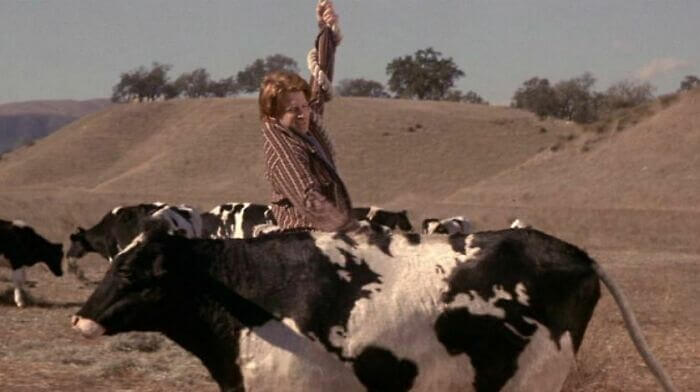
We're not sure if this one technically counts as a map or not, but we're including it because we love the film? This cow starred in the 2001 movie Rat Race with Seth Green. And if you look closely you can see that the cow has a scary accurate map of the world hidden in its spots. The black spots depict North and South America, as well as Africa, Europe, and parts of Asia.
Unfortunately, the cow used in this scene wasn't actually real, but it was still a cool little Easter egg included by those working on the film. It also fits into the movie's theme pretty well.
Map Of "Every" Chinese City
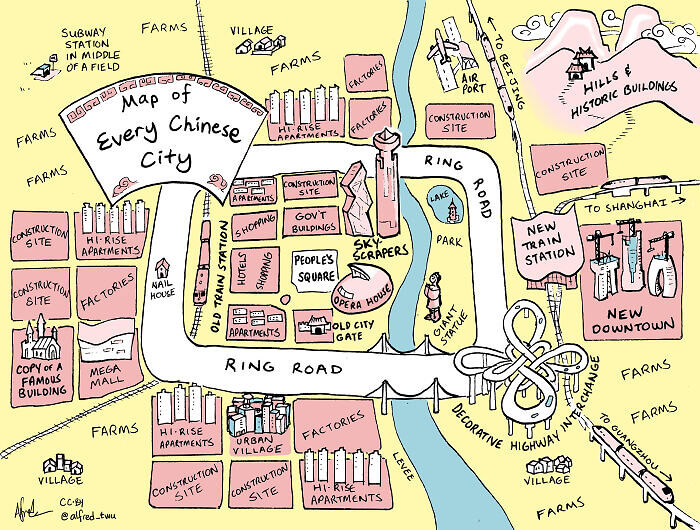
We've never actually been to a Chinese city, but like the map of "every" American city, this one seems to follow the stereotypes pretty well and be pretty funny. The subway station in the middle of the field is hilarious, as is the house in the middle of the road. We love that both the U.S. and China have a fascination with wacky giant statues and roadside attractions.
The really confusing interchange that's there just for decoration looks nice, and there are probably too many construction sites and random new buildings to count. There also seem to be quite a few farms.
The Most Popular Baby Names In London
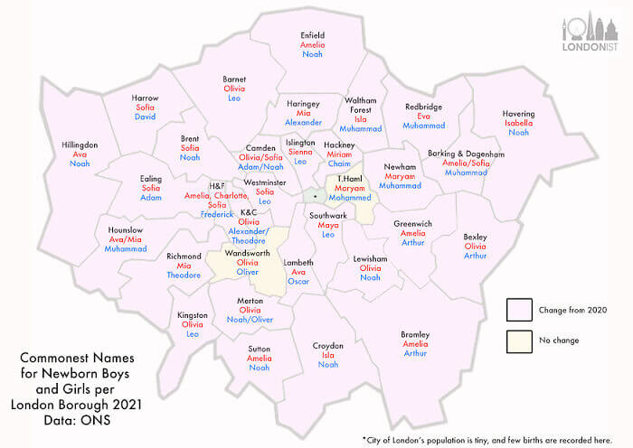
A map can tell you a lot about a place or a population, and this one is no different. It shows the most popular baby names in London in 2021, broken down by borough. Boys' names are in blue, while girls' names are in pink. There are a couple of boroughs where the name Muhammad is extremely popular, which means that there are probably a lot of people from the Islamic faith living there.
Names like Theodore seem to be popular in the more posh boroughs. Even though all you can see are popular baby names, there's so much extra information you can derive from a map like this.
Countries That Block News And Freedom Of Expression Online
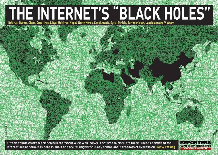
This map of the internet's "black holes" shows all of the countries where it's extremely difficult to access the news or express yourself openly online. The map itself is a bit old, but it still holds true for most of the countries on here. It's difficult to access independent websites that are critical of the Chinese government in China, and the same could be said for Belarus and Saudi Arabia.
However, Tunisia has probably gotten a bit better since the 2011 revolution. Syria and Iran, on the other hand, probably not so much. We're going to take a guess and say North Korea should probably stay on this map, too.

